Table of Contents
Datafield types
1. Settings
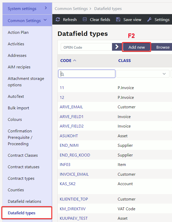
Datafields are located Settings → Common settings → Datafield types. By pressing „F2-ADD NEW“ can create a new datafield.
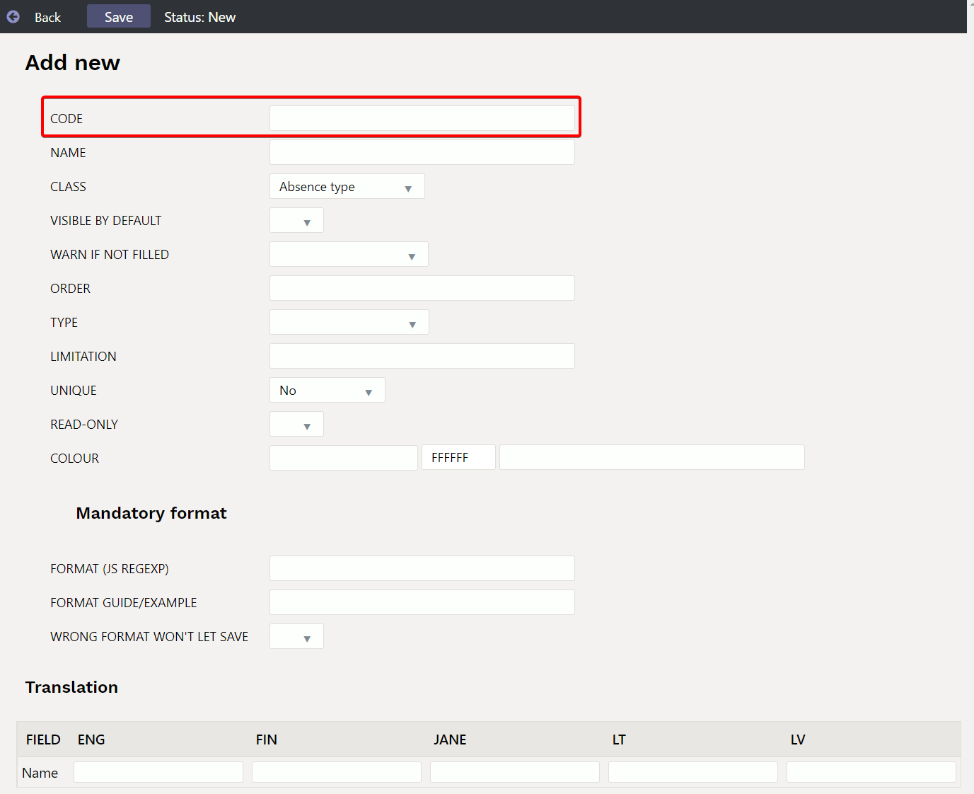
An empty datafield card opens:
Code - datafield code
Name - datafield name, it also goes to the document as the name of the datafield.
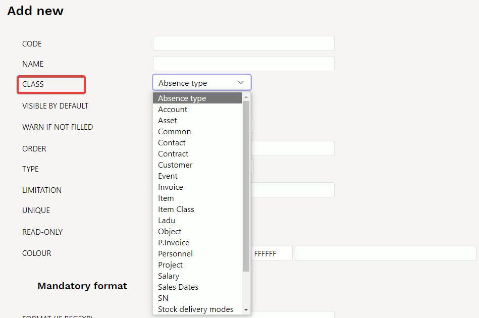
Class - indicates on which document this datafield goes to. If you select “Common”, this datafield can be used for all documents in the list.
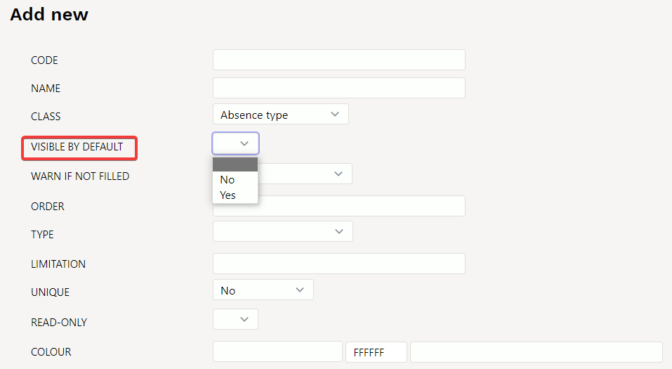
Visible by default - can be set whether this datafield is immediately visible on the document or should be added from the drop-down menu.
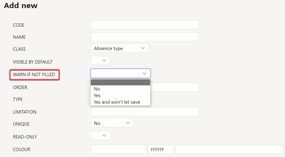
Warn if not filled - can be set whether a warning is displayed, a warning is not displayed or a warning is displayed and document cant be saved if this field is left blank.
Order - can be set in which order datafields are placed on document. For example, if 1 is marked in this datafield cell, it would always be the first datafield.

Type - sets datafield type. If the Type cell is left blank, any content can be written in the datafield. If Type: Text is selected, different text can also be written to this datafield, but this type creates placeholder from the tabel Settings → Common settings → Auto text. If Type: Item is selected, you can select an item from item browser by double-clicking in the the document datafield cell. Other options work by the same logic.
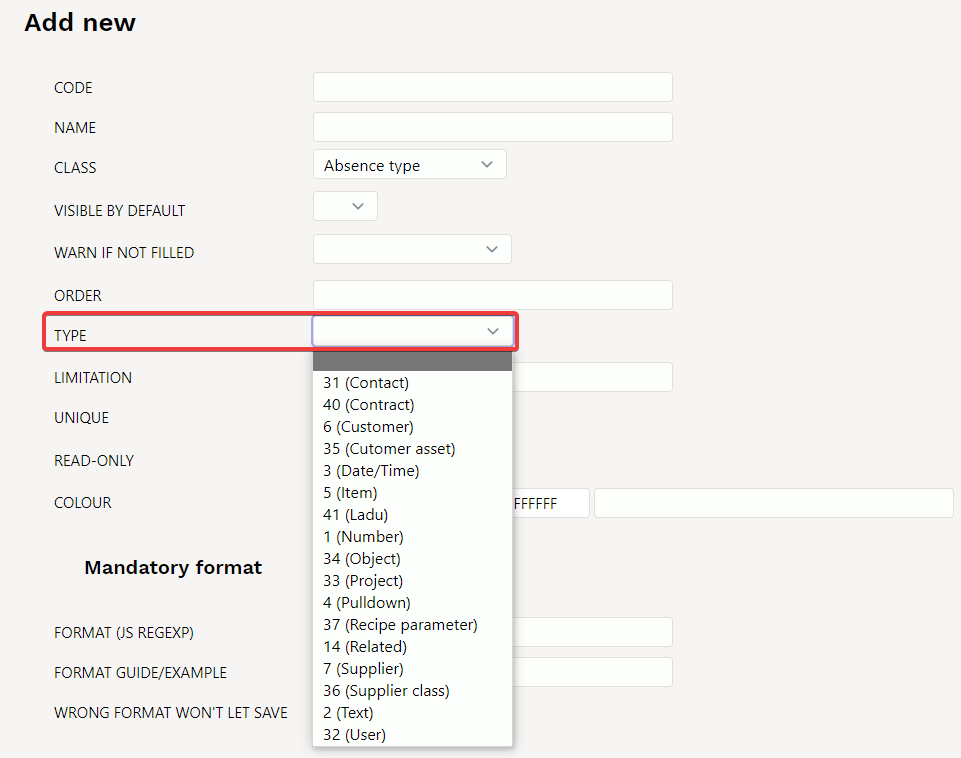
- Date: date/time type datafield, right click on datafield opens calendar
- Item, Supplier, User, Customer asset, Customer, Contact, Object, Project, Text are text type datafield, which opens corresponding placeholder with double-click or right-click.
- Number: number type datafield, gives warning when entering text
- Related: several datafields can be related and the contents depend on each other's choices. Defined in the module Lisaväljade Seosed and configured using the Limitation field.
- Pulldown: datafield with predefined options
Limitation - according to the type Related and Pulldown type datafield can be defined here.
- Related - the related code is defined here and the format of the multi-level datafield is CODE: level, for example CARS:1
- Pulldown - option list separated with commas
If an empty selection is required, the content should start with a comma. For example ,Dog, Cat, Pig
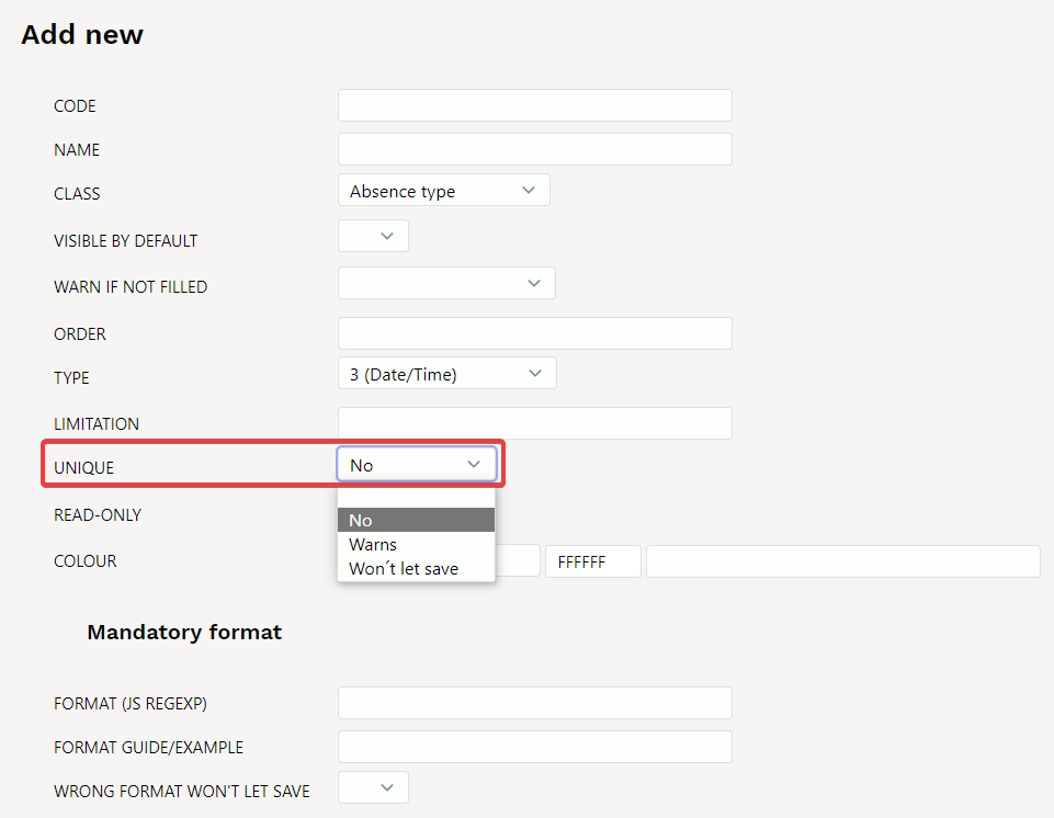
Unique - the contents may appear only once in the register or whether one datafield can be used twice in a single document or not - otherwise a warning.
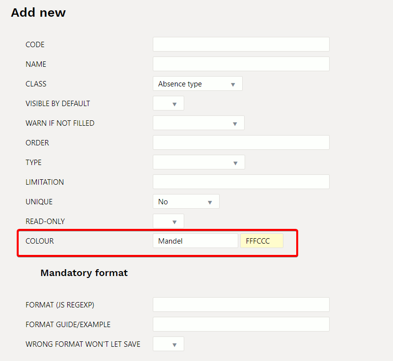
Colour - possible to choose what colour the datafield is on the document.
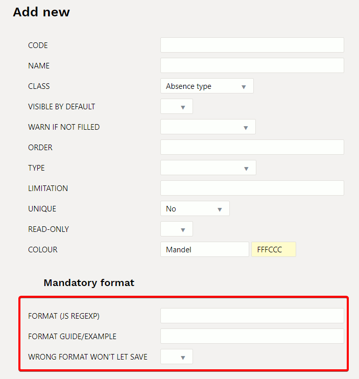
- Format: JavaScript RegExp format description of the allowed format. For example only number is allowed to enter: number
^[0-9]+[:][0-9]+$
- Format guide/example: A human language guide that is displayed when content is entered in the wrong format
xxxx:yyyy
The datafield made in the example would look like this on the document:

2. Examples of using datafields
2.1. Filled/Empty datafield - type PULLDOWN
For datafield pulldowns
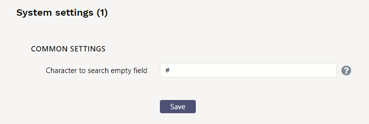
- Empty fields are searched by selecting Empty.
- All filled fields at once can get with the Filled option
Excluding multiple options from datafield pulldown
Example: if you want to see datafields and exclude a few options from the pulldown


